Hello fellow kids & developers! I decided to reverse engineer the Apple iPhone X website to learn how their slick “X” landing page is made. By combining a couple of effects it makes for a very powerful end result.
Note: It’s similiar to how I did the Avicii True Stories effect.
First things first, this is what we’re dissecting today!

Let’s break the gif down:
It starts with an X with a smooth moving plasma. Upon scrolling the X transforms into an iPhone and the plasma remains and becomes the screen. Everything slides in and out in motion. Tight.
Okey, so let’s dissect this thing.
Fire up your F12 Devtools (by pressing F12 in Chrome) or by right clicking the X and choosing “Inspect”.

When peeking at the DOM you will soon see the 3 parts that make up this magic!
- One
<canvas> - One
<div class="hardware-container"> - Inside the hardware div - One
<video src="nice moving plasma.mp4"/> - Also inside the hardware div - A second
<canvas />
So let’s take a look at these building blocks…
The Video
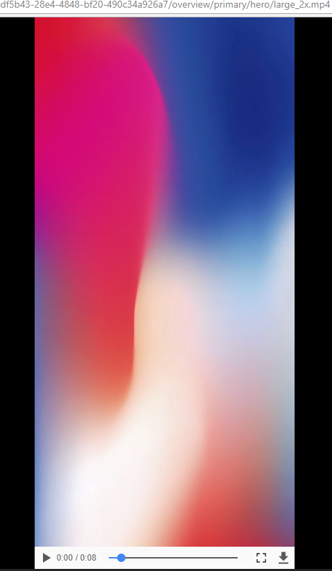
Okay, so the animation is simply a movie of the plasma. No iPhone, no “X”. Okay, so that’s nice. No black magic.
Here’s the movie source.
The iPhone hardware
So how does the plasma end up being the screen of an iphone? It’s all about adding layers in the right order.
A rule of thumb is that the browser renders HTML elements from the top-down, so if two html elements are competing for the same area on the screen, the second one would be the one we see (just like putting papers on top of each other). Apple’s webdevs uses this to their advantage, much like you could with layering paper cut outs on each other:
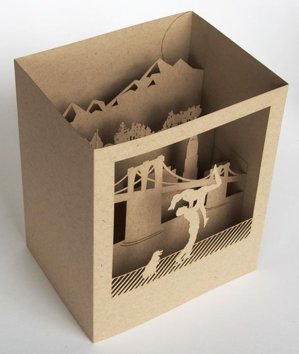
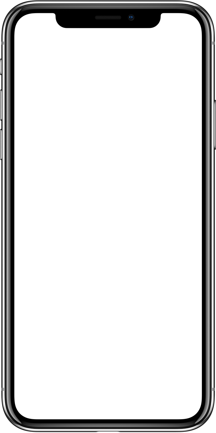
So they place a canvas over the plasma video. The content of the canvas is a transparent iphone with the rounded corners filled with white to avoid the video sticking out. Since the screen part of the iphone is transparent, whatever element is behind it (the plasma video) will be visible there.
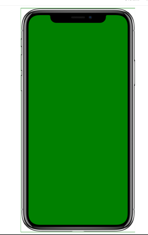
You can see this effect in action by adding for example a background color and a border to the canvas:
How about that X cut out?
Well, we already learned how to do this right? Let’s look at that first canvas element.
It sits above the harware-container <div> in the DOM, so the effect we just learned by layering stuff shouldn’t work -right? RIGHT!?
Well - unlike paper cut outs - in HTML we can bend the natural laws (that’s a lot harder to do with paper cut outs, if you figure out how to do that, please tell NASA).
It’s really easy to tell the browser that element A should be considered on top (or under) element B. This is done using the z-index property. If we inspect the first canvas parent div, we discover that this is exactly what has been done:
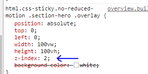
The higher an elements z-index is, the closer to the eye (more on top) it will be. If we change the value from 2 to 1, the X disappears behind the iphone hardware container div.
The transparent X cutout itself could be a PNG, but in Apples case they’ve used the canvas draw api to simply draw a couple of lines. I’ll leave this as a homework for you to do.
But everything is moving
And here we are - at the end with only the final puzzle piece. It all moves syncrhonized while the user is scrolling.
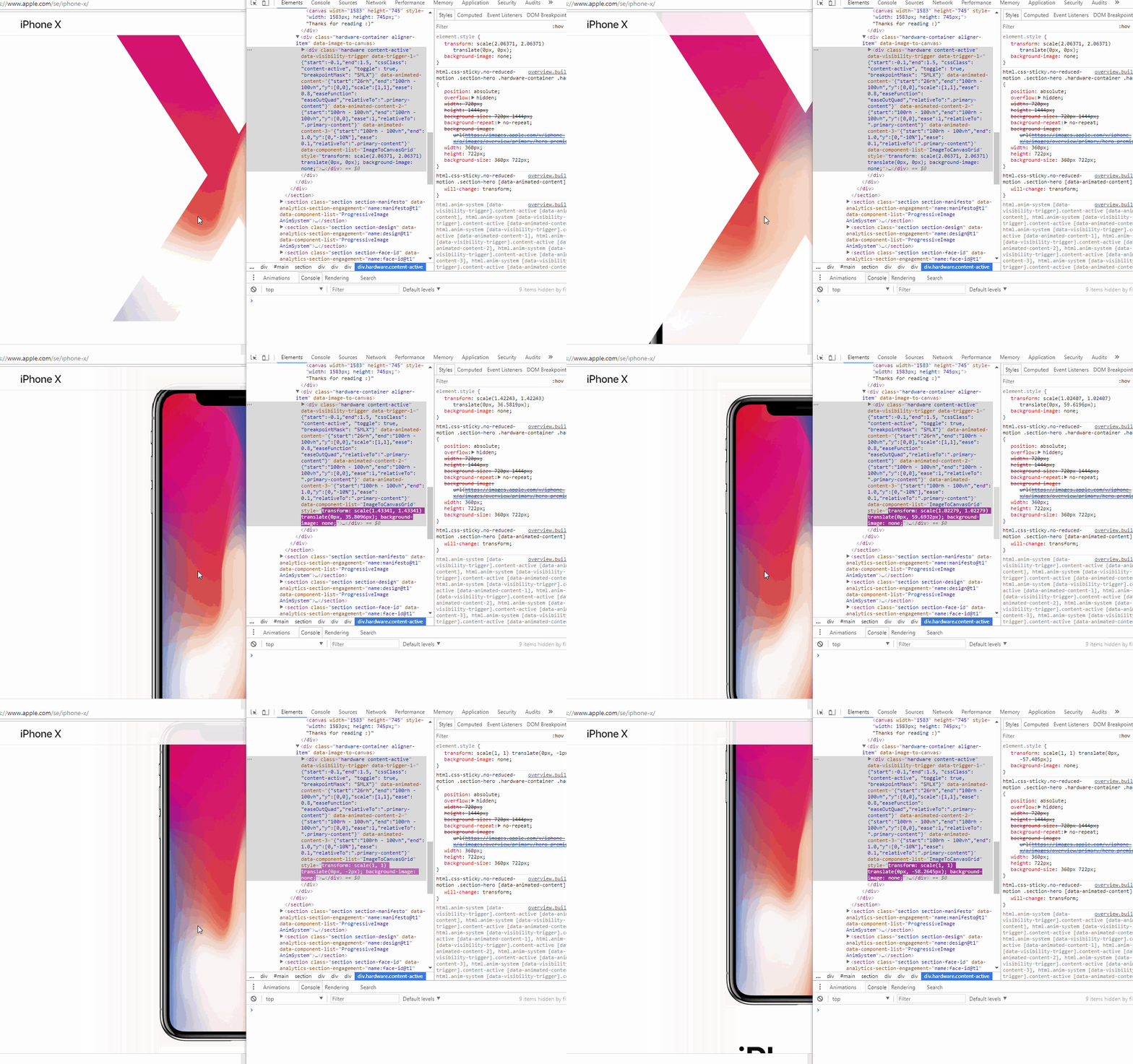
This is done by listening to the scroll event and adjusting the CSS animation property transform.
On scroll, we animate the X and the hardware-container with by changing the scale function and we make sure the iPhone is in the right position by also adjusting the translate value. You can inspect this in your browser and see the values change while scrolling:
Thanks for reading
Thanks for reading, hope you liked it! You can ping me on twitter (@andersaberg) with comments, it will make me smile!
If you liked this you might want to try reverse engineering the similiar effect i made for Avicii True Stories. You could also have a look at the css animations at Listen to the clouds.
Please take care of youself and keep on learning!
/A